Saturday, May 31, 2014

The Mood of Color

Raise your hand if you like to play it safe and go with neutrals. I do. Sometimes. In some rooms, beige or grey feels right. 

But, some spaces demand color. Why? Probably because you're trying to convey a message. To communicate a feeling - or better yet, to bring on a mood. Certain colors and combinations of colors contain visual cues that trigger certain responses, like excitement, comfort, or peace. Think about it - most people want their bedrooms to be a calming or soothing retreat. That room demands a hue that elicits those feelings, like sky blue.

Whenever I'm feeling uncertain about a color combination I turn to a book that's been in my library since my early days as a graphic designer. It was printed in 2000, but its content is classic. It's called Pantone Guide to Communicating with Color. The book's focus is on using color in printed design, like magazine advertisements, but its theory applies to home decorating, too.


It's fascinating really - reading about color and the subliminal human reaction we have to it. Color wields power - in both marketing and in your home. The color red causes excitement because upon seeing it a chemical message is sent to the brain and releases the hormone epinephrine. I know, that's a lot of mumbo-jumbo to me, too. Basically it increases your heart rate. Neutrals impart a message of dependability. They're seen as timeless, enduring - probably why people who love the traditional style of decorating like neutrals.

So back to this book - when I'm feeling ambitious about color, and want to go for a combination that shouts - look at me…I open this book. Check out the pages here. They include color combos with specific non-verbal messages.


Here black with yellow rivets the eye and makes us think of stinging insects. It feels pretty powerful to me!


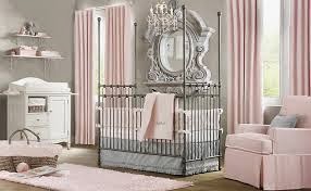
Oh my, this is adorably romantic! Soft pink - I'd do this color scheme in my own bedroom if hubby would allow it!


Purple creates a sense of the surreal. Probably why so many churches have purple stained glass, and lighting.


This certainly elicits a calming feeling for me!  I have this same color paint in my sunroom, where my office is. It helps me concentrate.


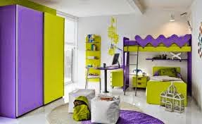
What kid wouldn't love to play in this room!!


There's no doubt about it - color is awe-inspiring. Thank God we see in more than just black and white!


Wednesday, May 28, 2014

May is National Pet Month

I'd be remiss if I let the month of May slip past without mentioning National Pet Month!  So, I'm going to bring back a post I did two years ago - in honor of our beloved 4-legged babies!  Even if you've read it before, take a moment to get through the whole post, because at the end I have added some new content.  Enjoy!


There's no denying that pets make a home happy. Hairy too! But, I overlook that for all the joy and love my dog brings our family. In honor of National Pet Month, here's a post devoted to our furry friends - especially Charlotte, my 8-year old yellow lab baby.

Char-Char at 9 weeks old...


Today...


These days, there's all kinds of designer decor to glamify your pet's space in the home. I personally love the idea of giving your 4-legged love their own space. A place to eat, a place to sleep (if your spouse is against them sleeping on your bed - good thing for Char that hubby is overseas a lot!), and a place to just chill during the day. And why not make those places lovely by coordinating them with your decor?

This is Char's dining area in our laundry room. I wish she had a room all her own, but this little space gives her a quiet place to eat away from the activity of our kitchen and our 5-year old.


The vent keeps it nice and warm in the winter and cool-as-a-cucumber in hot weather. She likes laying on the vinyl floor in the dog-days of summer. (I know - dog puns - stop already.) The aluminum food storage pail was purchased at HomeGoods, and definitely looks more stylish than a big ole yellow bag of Pedigree slumped in the corner. (To be honest, we keep the food pail in the garage. I brought it in just for the photo. If you keep your dog food in the garage, a tin container like this is the way to go. It will keep the mice out of your dog's food. Lesson learned - do not use a plastic container - mice chew through!)


I bought this painting at a HomeGoods. This epitomizes Charlotte - the tennis ball-obsessed girl that she is!


I like the little rug under her bowls - keeps the area tidy and coordinates with the curtains. These curtains were hung purposely just above the floor -to keep them clean and from inadvertently dragging into the bowls.


It's a dog's world! This adorable plaque was a gift from my bestie, Sharon.

And here is Charlotte's bed in my office/solarium. She usually chooses to lay in here when I work, so I was giddy when I spied this doggie bed at HomeGoods that completely matched my color scheme: sea-foam blue and brown.


From this perch she can sleep in the sun or keep watch on what's going on out back.


And pose for mommy's pic!


When she isn't lounging on her bed, there's one other place she calls her own. Even hubby has given her reign of this couch. The zebra throw protects the couch (well, not really, it still gets hairy) and looks pretty cool too!


When I was thinking about this post, I surfed the net for doggie decor, and found a lot of inspiring ideas. I love this pet bed made from recycled pallets!


And I thought this was a great idea for providing kitty with indoor activity, while still looking architecturally cool!


And beds! Wow - there are sooooo many unique, stylish and inventive pet beds out there. Kind of makes Char's bed look like she's sleeping on a Flintstone slab of bedrock! Check these out!

Aqua lucite - for the posh pup!


 Kitty can still sleep next to you, without actually being on the bed! Awesome idea!


Wish they made this basket-style bed in big dog sizes! I would so be snapping one up for my big girl!


And I can't forget our fish-friends... I love this modern fish condo! Except it needs some rocks and plants. A fish has gotta feel at home too!

The pet decor available on the market is endless. There's no reason Fido and Fifi's digs can't coincide seamlessly with your style. And the options look so comfy. Heck, I'd sleep in some of those beds! Charlotte is looking over my shoulder, silently making her picks right now. Ahh, if only we could read their minds!

NEW!!
And here's something new to honor the pups and kitties in our lives - Simply Said has wall quotes for them too! There's cute sayings for dogs, cats, even horse-lovers! 


Or dog, in my case! 
Give your pets a hug!


Saturday, May 24, 2014

Applying a Simply Said vinyl design to chalk painted furniture

When I was painting a lot of furniture, I loved putting designs on them. Chevron was very popular. So was anything french, Paris or script-inspired. It still is. The problem for me, was that I was relying on stencils to achieve the look. With stencils, I always had a little paint bleed-through and could never achieve the crips, clean edges I desired. Transfers were another option (using tracing paper to imprint a design onto a painted surface), but they took forever to fill-in with paint. And again, my hand wasn't steady enough to get the crisp edges I wanted.

BUT NOW - there's a solution to the edge issue. And a big time-saver. It's vinyl designs. I just applied my first Simply Said design to a little side table and I LOVE it! It took a whole 3 minutes to apply!


Here's the easy steps to applying the design:


1) I applied it over a piece that was painted with Annie Sloan's chalk paint in Old White, with clear wax.

BEFORE


 I ordered the design in a grey color that looks a lot like Annie Sloan's Paris Grey. Look how pretty it is!


Next, I laid it grid-side facing up and ran the application tool across the entire surface to rid it of air bubbles.


 Then I began in the top corner and slowly pulled the grid paper back and down to remove it.


Next, I laid it over my table.


Then I used the application tool again by running it over the whole surface to remove air bubbles and flatten it to the table.


I started at the top left corner and pulled the paper back and down to remove it slowly.


And there she is! Pretty!


It really looks like its painted on! I couldn't be happier with it!


Monday, May 19, 2014

Wallscaping! Examples and the step-by-step to creating your own beautiful gallery wall.

So what is wallscaping you ask? It's my made-up word for dressing up your walls. You've probably heard of gallery walls, where you group photos into a pleasing arrangement on your walls. Wallscaping takes it to the next level. Like landscaping where you plant flowers and greenery in various heights and colors to achieve a cohesive look, wallscaping follows the same principles.

You can use a variety of photos, mirrors, frames, collected items, antiques, sports equipment - really just about anything - and arrange it on the wall in a pleasing manner. Wallscapes can be coordinated by color, theme, size, or shape. Sometimes the groupings are symmetrical, others haphazard. Always completely interesting!

Here's some examples from the Pottery Barn catalog that inspired me to create my own wallscaping.


Of course everything Pottery Barn does looks great and the above example delivers. Love the Americana theme, and use of items in a variety of shapes. The oars are unexpected, yet create the rectangular shape and draw the eye across the top.


Here they keep the look consistent with black frames, and throw in a few circular pieces to keep it interesting! This is one of my favorites - its like a museum exhibit!


Again, this space makes use of the black frames, but throws in a few antique-inspired pieces to keep it interesting.


A few of my friends have wallscaped their spaces, too. My friend Tara did this wall in her rustic-themed basement (it's so cool, there's real whiskey barrels down there serving as side tables!). I love the use of large and small pieces.


Tara is a professional photographer (you can see her work here), and takes full advantage of her gorgeous children as models. Here she created a gallery wall along the staircase. Awesome frames!


My friend Hillary is a master of wallscaping! Check out the nursery she designed for her new baby. Of course, the theme here is little-boy inspired with a fishing rod, antique toy cars, alphabet letters, and more. Isn't it downright adorable!!


Here's a pretty display in her living room, too!

So, after all the drool-worthy inspiration, I was motivated to create my first wallscaping, too. I thought I would document the process for you here, so you can create your own wallscaping.

Steps to Creating Your Own Wallscaping


1) Find your space. I have a 2-story great room with really, really large walls. They are an overwhelming blank canvas, that I have fretted over for 3 years. It was only recently that I felt I could tackle a big project like this. So, I decided this wall was it!


2) Gather your items for the wall. You may have precious family photos you want to display, or heirloom antiques that deserve some spotlight. Maybe you have a movie-theme in mind for your man-cave, or boating items for a nautical theme. Put all your goodies in one area and look at them to determine how much space you need vs. how much space you have. 


3) Take your piece that you want to be the focal point and hang it on the wall. For me, its this antique frame I scored for a couple of bucks at a yard sale. Then map out the remainder of the space you plan to use with painters tape. Don't worry about getting the lines straight. You'll use a level when hanging the items. Measure the height and width with a measuring tape.


4) Using your measurements, layout the same sized space on your carpet with the tape. This is your staging area.


5) Start experimenting with layout. Move items around. See what you like. At first, I thought I wanted my big frame off-center. I laid it down first, and began adding items around it. I started with the circle basket on the top right corner, then went for balance by adding the circle mirror on the bottom left next. After I had everything in my space, I took a photo to remember the layout, in case I changed it and wanted to go back to what I had originally done. This layout didn't float my boat. Something felt "not right."


6) Then I tried another layout, in which I put the focal point in the center. I liked that better. 

7) Items to gather before you start hanging to keep the process moving: a level (make sure you level everything, especially big pictures and shelves), hammer, drill, screwdriver, pencil, tape measure, nails, wood screws, drywall anchors, and those easy to hang wall hanger things that are hook-shaped. They are a breeze for hanging light-weight items in drywall without a stud. Where there are studs you'll need to use nails or screws, and where there's just drywall, the hook things are great. Or use the anchors. Measure and remeasure or you'll have one too many extra holes in the wall. (take my word on that)

7) I started with my focal piece (the big frame) and worked from the 4 corners in. I slowly added pieces by holding them up on the wall and adjusting the spacing as necessary. Be flexible and adjust your layout as you deem necessary. For some reason, things might not look as good on the wall as it did on the floor!


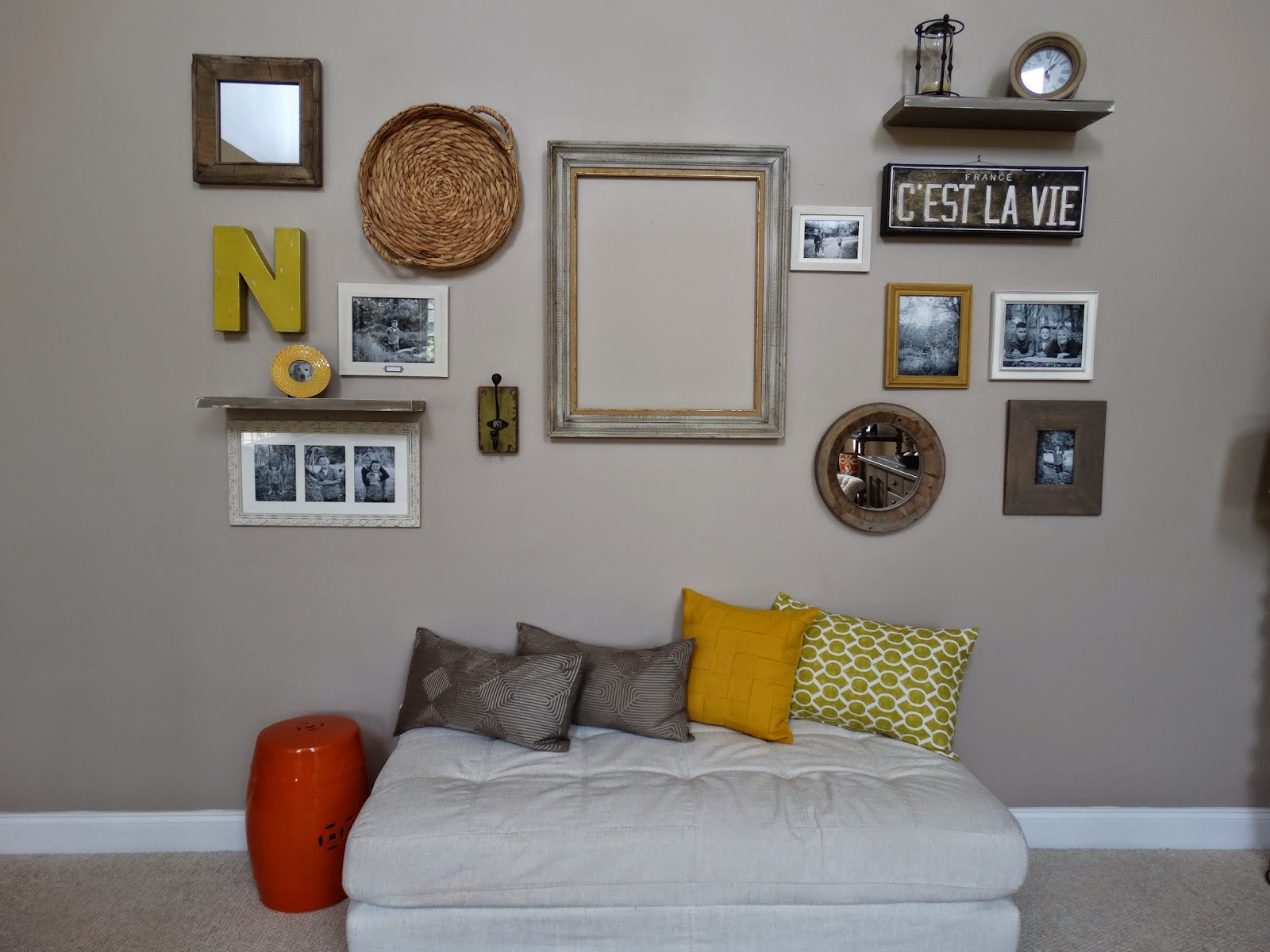
Here's what I ended up with!


I've got a mix of family photos, mirrors, an art canvas, metal initial, and other odds and ends. I wanted a variety of textures in neutral tones to match my decor, along with an accent of yellow.


My black and white family photos were taken by Tara Sutherland, who I mentioned above. So beautiful!


Inside the frame I plan to hang the piece de resistance - a Simply Said vinyl design. It looks like this!


It's the big one that says "Always believe that something wonderful is about to happen." I had it designed in a chocolate brown color to match my accent wall across the room. 

I'll be hanging it as a demonstration at my Simply Said business launch party, scheduled for June 6! I am super excited about it - because this new opportunity fits right in with my love for decor. The Simply Said designs are perfect for wallscaping - in fact, I think its the perfect way to showcase their wonderful messages, or to personalize your space. Look for a lot more ideas using Simply Said designs in coming blog posts - my brain is overflowing with fun things - wait and see!

Speaking of wait and see - as soon as I have the design hung inside the frame, I'll update this post with a final photo - so you can see just how striking it becomes.

And here it is!!!!!!!


Stay tuned for a link to my Simply Said website! Coming May 28th! 


Thanks friends!